“Opening the Book worked with us to tailor the discovery layout to our users and our building. They worked hard to get the best customer flow and took great care to ensure the layout accentuated the building’s architectural features including our central rotunda and surrounding pillars, large window overlooking the garden and fireplace.”—Cathy Simpson, Chief Librarian & CEO of NOTL Public Library
Niagara-on-the-Lake Public Library
The Library
The Niagara-on-the-Lake Public Library originated in the 1800s and has been an integral part of the community ever since. The current library is a beautiful building, designed by Chamberlain Architects in 2000. The library is an important part of local life but it was recognized that the look had become old-fashioned and there was a need to reach out beyond current library patrons to new communities and younger generations. The library must become more accessible if it was to play as important a role in community development in the next twenty years as it had in the past twenty.
The renovation plan started out with a simple proposal to replace the carpet but when Cathy Simpson became the library’s CEO in 2012, she spearheaded a larger scale project that included accessibility consultations, focus groups, and surveys to determine additional library interior changes that needed to be addressed.
The Challenge
The consultations, focus groups, and surveys that were conducted confirmed that the layout of the library did not allow for good traffic flow and the tall corridor shelving did not meet standards for wheelchair accessibility. New needs for a multipurpose/flexible space were identified, technology needed upgrading and there was a lot of enthusiasm for a newly proposed Makery.
To accomplish the renovations, a lot of fundraising needed to be done. A capital project was started in 2011 to replace the library’s carpet and this built into a wide program of grant awards, local sponsors and generous individual donations.
The Connection
During the 2016 Ontario Library Association trade show, Niagara-on-the-Lake (NOTL) Public Library CEO, Cathy Simpson, attended a presentation by Opening the Book director, Rachel Van Riel. Cathy was very interested in Opening the Book’s philosophy on library design, discovery layout concept, and their innovative ways to display and merchandise books. She was excited to speak with Rachel and learn more about how she could work with Opening the Book for their library renovation project.
Rachel planned a visit to Niagara-on-the-Lake Public Library, along with a representative from Schoolhouse Products, Opening the Book’s dealer partner in Canada, to meet with Cathy and further discuss the needs of their space. Rachel met with library staff first, did a walk-round with lots of discussion, and ran a training session on new approaches to library layout which drew on evidence of changes in patron behaviors. In the evening Rachel presented this new thinking to the Library Board who were enthused by the approach and wanted to move forward with the project.
It was important to Cathy to have everyone hear how Opening the Book’s discovery layout, furniture, and book display approach could work for them. Chamberlain Architects were contracted to design the building renovation and Kyle Nichols, their Vice-President, was able to attend the Board too, establishing a good connection so that architecture and interior could work well together.
Cathy also took up Opening the Book’s consulting services which included collection layout planning, merchandising planning, and signage design. The consultancy package also included staff training and development to ensure all staff were on board with the new ways of working.
The Design
The Opening the Book design team worked with Cathy Simpson and Chamberlain Architects to develop the best use of the space. The windows to the lovely outdoor garden area were unused and the new architect plan opened these up so the Opening the Book furniture layout created great sightlines to this. The lovely rotunda area was the main computer location, because of electrical connections, but this blocked the space and the rhythm of the architecture. It was agreed to move computers to the new Makery, created by Chamberlains in an ex-staffroom area, and the rotunda space was redesigned by Opening the Book to become a multi-functional space with mobile shelving which can be moved for special programs.
Everyone bought into the concept of discovery layout which banished straight rows of shelving and substituted Opening the Book’s Propeller and Arc shapes in a layout which respected the symmetry of the building. The discovery layout meets ADA accessibility requirements, allows for better flow throughout the space, and creates zones for collaboration and quiet areas. The younger and older children’s areas contain bookcases and furniture at the appropriate height for those age groups with fun elements and colors to invite them in to explore.
“Opening the Book worked with us to tailor the discovery layout to our users and our building. They worked hard to get the best customer flow and took great care to ensure the layout accentuated the building’s architectural features including our central rotunda and surrounding pillars, large window overlooking the garden and fireplace.”—Cathy Simpson, Chief Librarian & CEO of NOTL Public Library
The Furniture
As you enter Niagara-on-the-Lake Public Library, the mid-floor Book Tables and Double-faced Book Pods create beautifully merchandised book displays where patrons can quickly choose items to check out. The discovery layout brings patrons through the space and creates a flow so patrons can easily browse the collection. Performance Mobile Bookcases are used in the rotunda and can easily be moved or reconfigured so programs or meetings can take place in that area.
Performance Wall Shelving with Lightbox Graphics and mid-floor shelving showcase the Adult collection and the signage clearly shows what is shelved in each section. The shelving is used to zone the space and creates social and quiet areas through the library. The magazine wall shelving sits adjacent to the cozy fireplace sitting area.
Cathy stated that “The shelving really showcases the collection and makes browsing or finding specific titles easy and enjoyable. The wood and laminate finishes give the shelves a warm look and flexible shelving configurations along with custom signs and on-shelf acrylic displays make it easy to merchandise the collection.”
Performance Wall Shelving with teen-themed lightbox graphics designate the area for teen patrons, as well as graphic novel display units. A table is located in the center of the area so teens can hang out and study.
Brightly colored BookSpace mobile bookcases indicate where to find the children’s collection. The bookcases are 48” high so they are the perfect height for young patrons. An archway leads to a special section for smaller children that contains 36” high BookSpace shelving containing the board book and picture book collections. A bucket seat is included adjacent to the shelving, so kids have a place to sit and read. A Picturebook Tunnel is in the center which integrates reading with play.
The Outcome
“We really love the fact there is solid research and observation of user behavior behind the design of the shelving and layout. We also appreciate the training and consulting Opening the Book provides to library staff. The discovery layout is based on a different philosophy of library service than traditional layouts, so staff training is key to its success.”—Cathy Simpson, Chief Librarian & CEO of NOTL Public Library
Nine months after the opening day, Cathy reported that there is a 99% positive response rate from the public, visits are up, circulation has increased, customer satisfaction is high, workflow for staff is good, and the new spaces are well used. What a success!
Patron Quotes:
“The rotunda really stands out now. Spectacular!”
“Beautiful, so open and spacious.”
“Love the curve of the shelves.”
“For a town this size, this is a fantastic library. We’re very lucky.”
"Libraries are for everyone. In practice this means meeting different - sometimes conflicting - needs at the same time. Libraries are places of potential where people can access digital and print resources to take their lives in new directions. They are also places of comfort and connection where people who are isolated or troubled can feel part of the community without any pressure. The interior design at Niagara-on-the-Lake seeks to balance the needs of different communities harmoniously in one library."
Rachel Van Riel, Director of Opening the Book
More Case Studies
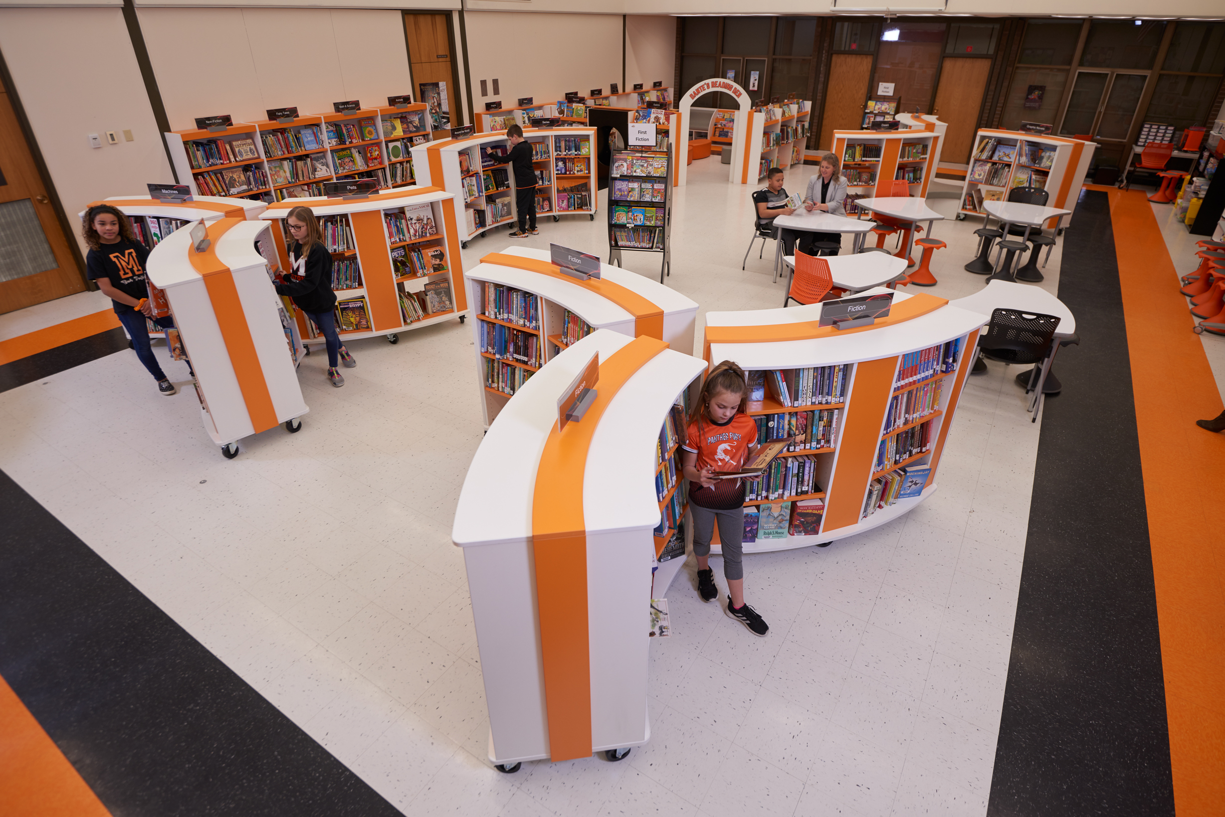
Morton Mandan Public Library
Learn how Morton Mandan Public Library worked with Opening the Book to design and create a dynamic space for their community that is flexible as well as inviting, engaging, and accessible for patrons of all ages.
View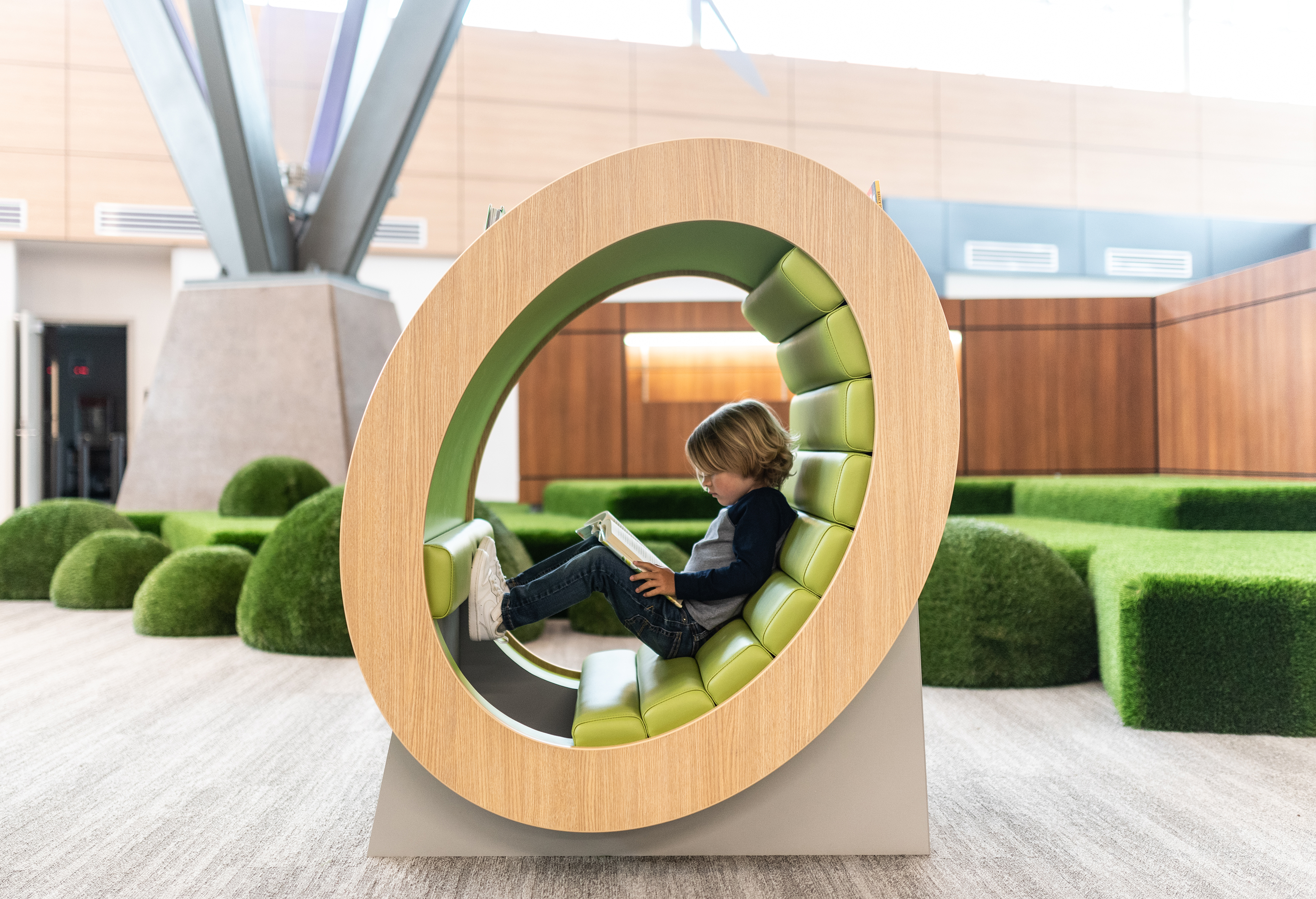
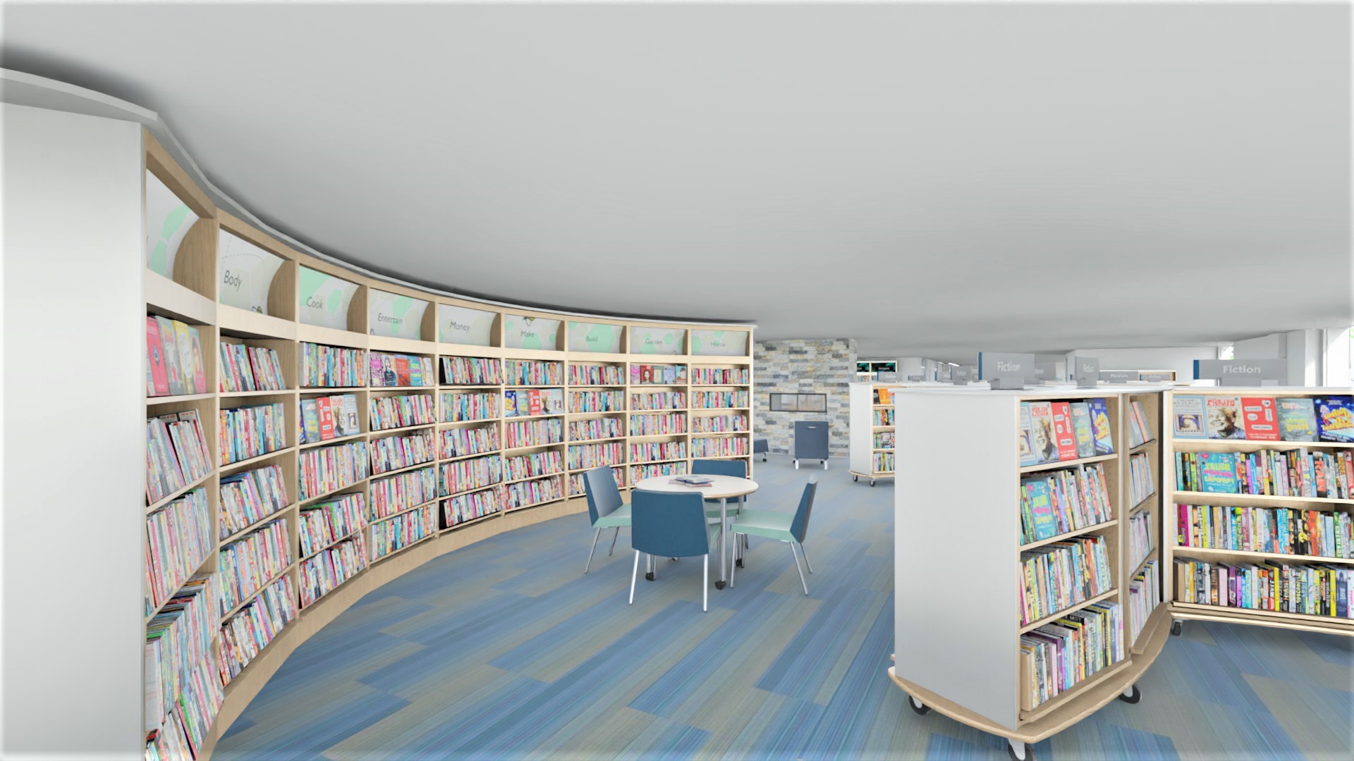
Walnut Grove Media Center Design
Take a visual tour of the new Walnut Grove Elementary Media Center.
View
Reimagining the Riviera Beach Public Library
Learn how the interior of the Riviera Beach Public Library was reimagined to be a state-of-the-art, unique facility for their community to use and enjoy.
View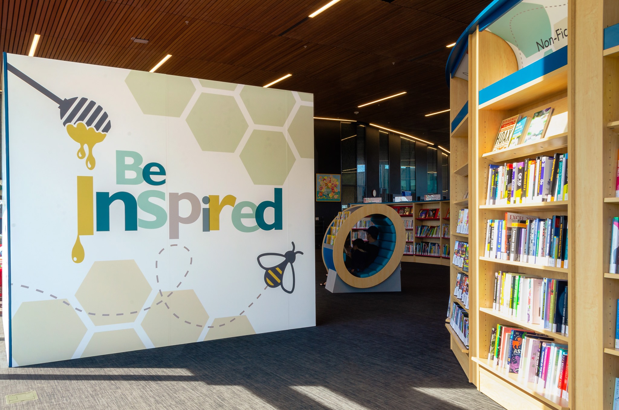
Revolutionary Library Design
New library buildings often end up with traditional library interiors. The story of Milton Public Library's Sherwood Branch shows how the shelving layout at the core of every library can be re-imagined to match the building aspirations. Get this right and both footfall and circulation will out-perform all expectations!
View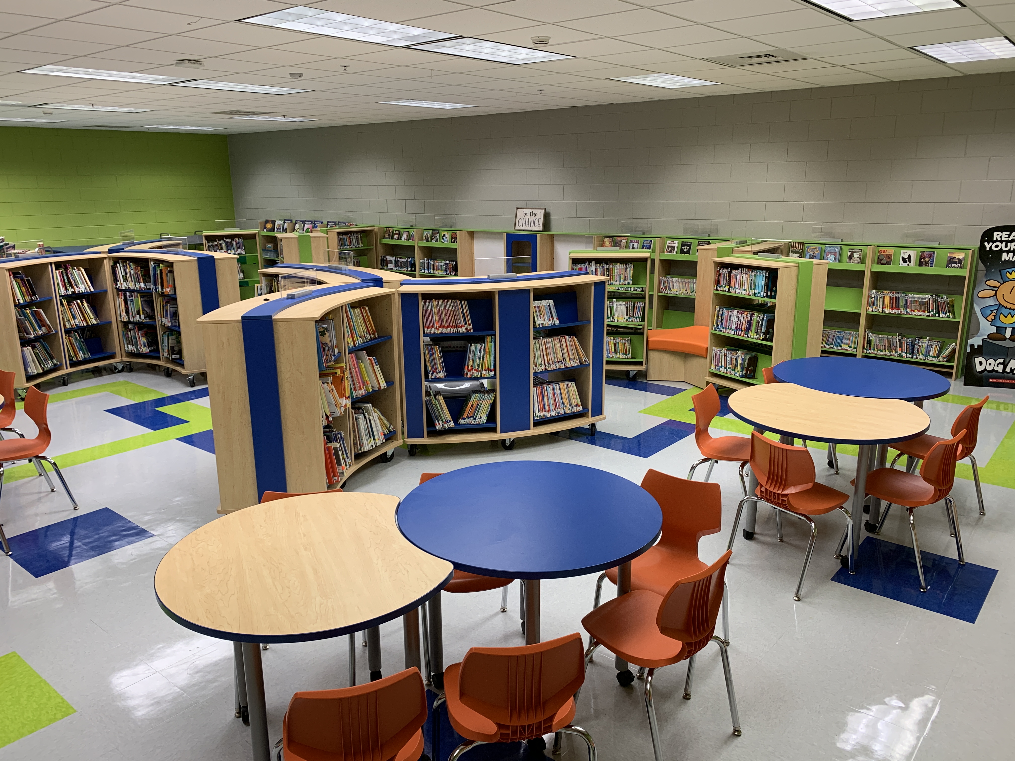
Elementary School Library Makeover
Read on to learn how Opening the Book designed a school library to be the flexible, functional space that they needed.
View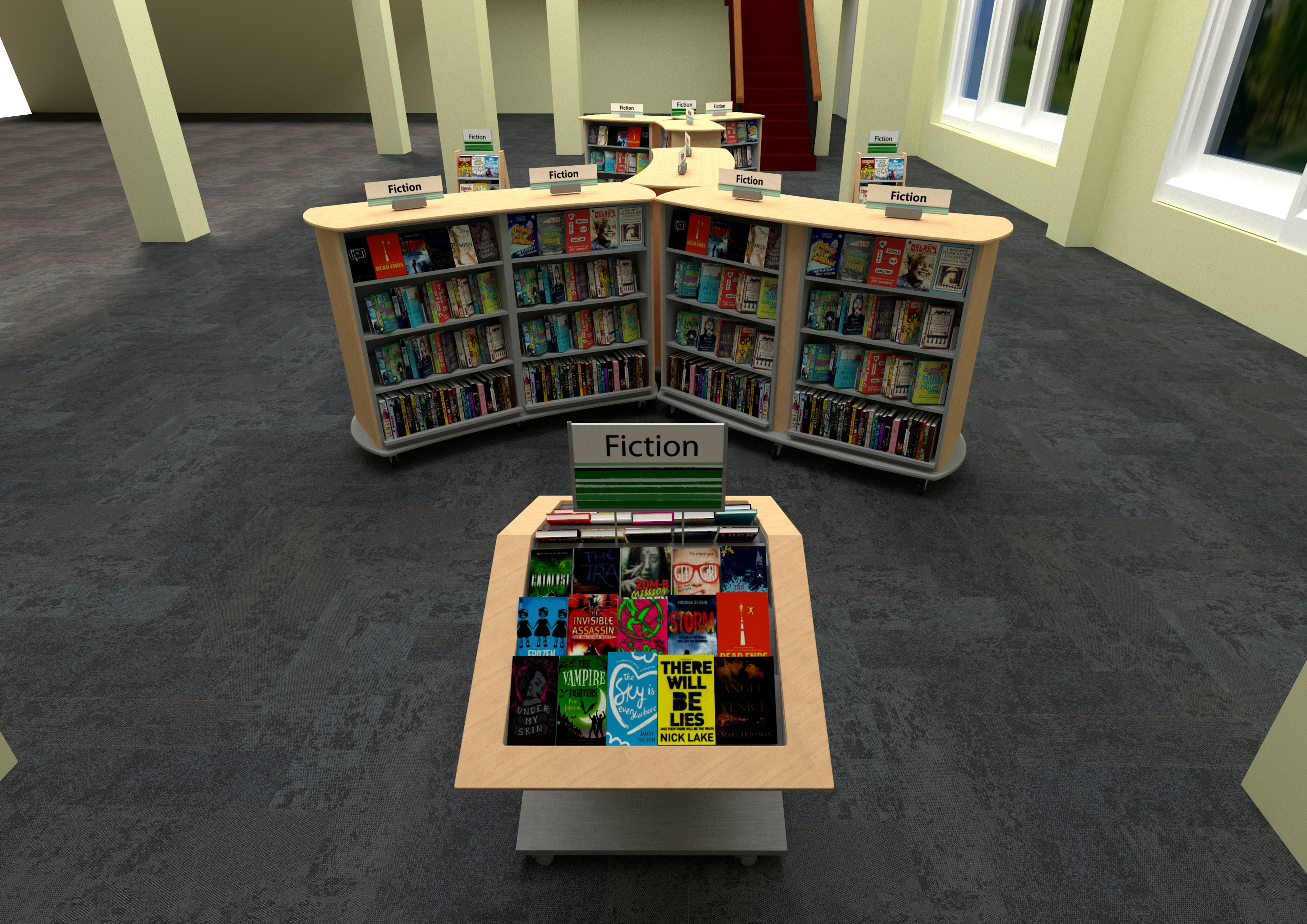
Library Entryway Design
Learn how Opening the Book designed a library entryway to create an impactful first impression and showcase their new materials collection.
View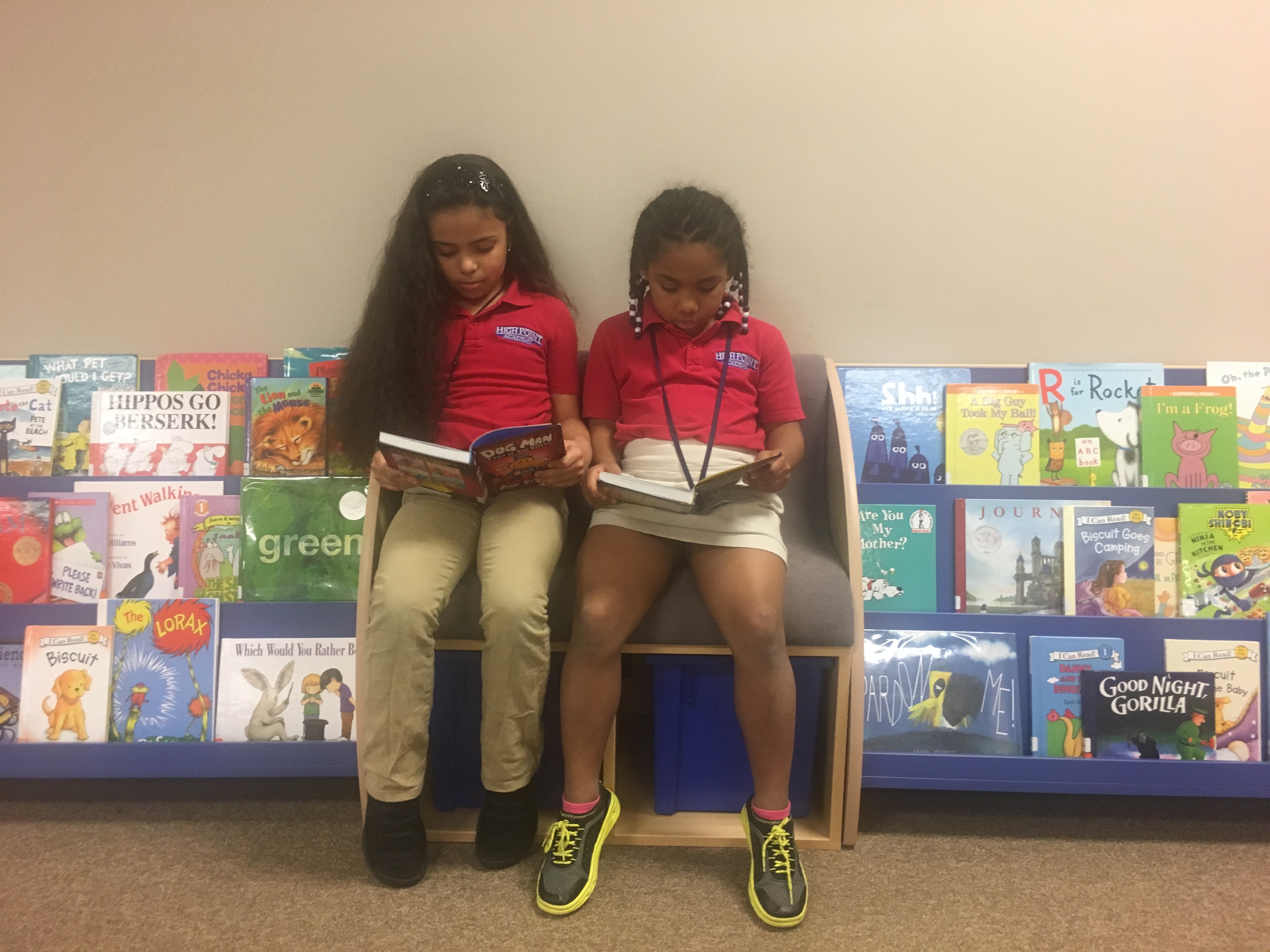
School Library Furniture Update Helps Students Find New Reading Choices
See how Opening the Book helped High Point Academy open up new reading choices to their students with a layout and school library furniture change.
View
The Heart of a Texas School Campus
Balancing functionality and budget with jaw-dropping features – and all turned round in a week!
View
Animating a Children’s Library Space
Breathing new life into a children’s library that had gotten a bit tired ….
View
Creating Browsing Neighborhoods
How Opening the Book supported one library’s move to replace Dewey with friendly neighborhoods of related subjects.
View United States
 Canada
 United Kingdom


