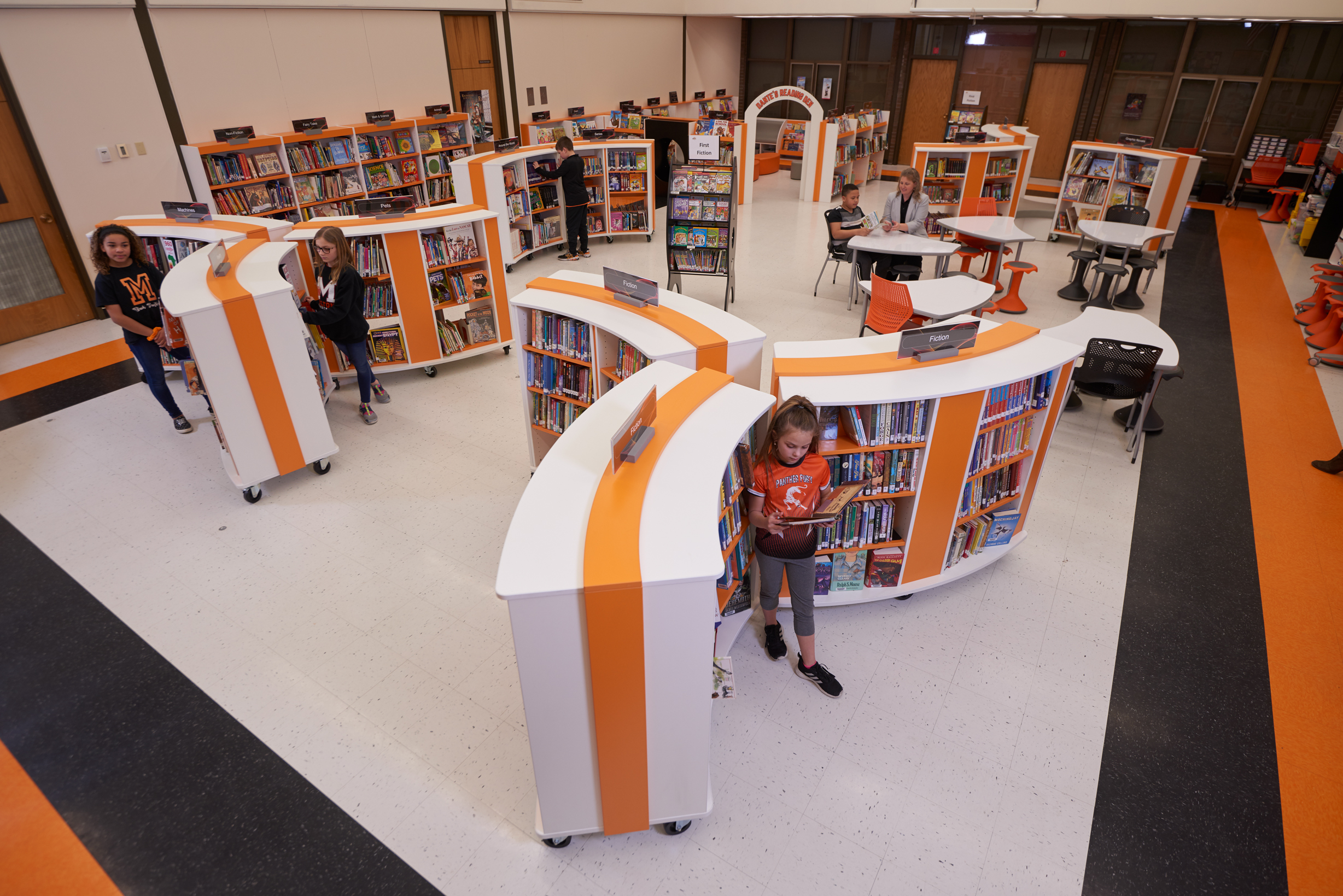
The response to the new library shelving and design has been overwhelmingly positive, from both children and adults.
Animating a Children’s Library Space
The Library
Ingersoll Public Library is one of two large branches in the Oxford County Library system. Oxford is a largely rural and agricultural county in Southwestern Ontario. The Town of Ingersoll has a population of approximately 12,000. The library inhabits the ground floor of the Ingersoll Town Centre, constructed in 1996, with the Town’s municipal offices and Council Chambers located on the second floor. Ingersoll is a vibrant community hosting a number of popular festivals throughout the year.
The Challenge
The children’s area had not been refreshed since construction in 1996, apart from the addition of a mural, and Lisa Miettinen, Chief Librarian of Oxford County, and Lynn Sutherland, Branch Supervisor, were aware that it was looking tired.
Staff reported that the stacks in the children’s area did not see a lot of traffic. New funky lounge pieces had helped to lift and define the adjacent Youth Area and this made it even more apparent that there was nothing exciting or inspiring in the children’s space – seen objectively, it was not particularly welcoming.
Some sort of barrier or partition was also badly needed where the adult computer desks faced directly into the children’s area.
The Connection
The plan was to start fundraising for new furniture. As so often, the focus was on seating and activities rather than on shelving. When thinking of how to bring a space back to life, it is often assumed that more activity tables and seats are the way forward; the capacity of well-designed shelving and book display to animate a space is under-estimated.
But then Lisa and a colleague attended a presentation by Rachel Van Riel, hosted by Schoolhouse Products at their showroom in Toronto, and learned all about changing trends in library design and Opening the Book’s Discovery Layouts.
Lisa says: "I was so impressed with Rachel’s presentation, and her insights into the impact library shelving design has on behaviour. The new 'propeller' shape of OTB shelving was so attractive and unique, I knew we had to consider it for the Ingersoll project. We had purchased curved metal shelving for the Tillsonburg branch in 2013, but given that it is manufactured in Europe, the cost to replace all shelving in Ingersoll’s children’s area would be prohibitive. OTB shelving is manufactured right here in North America."
The Design
Opening the Book developed a Discovery Layout for Ingersoll which used the unique curves of the shelving to create the much needed zoning between the children’s area and the adult computer area.
The space is now better zoned for different ages – under-fives and 6-11s – so children and families can easily navigate to the right section.
Consultation with children who used the library had identified that a Lego Wall was a big priority and the library staff successfully created one with the children. The Opening the Book design presented books alongside the Lego so the choice is both/and instead of either/or.
The Furniture
Ingersoll chose Opening the Book’s Performance Shelving line in a white laminate that has brightened their space considerably. A retail-style feature display wall was created across the corner so the lightbox graphics give maximum impact from a distance. The curve of the shelving was then extended out into the space to create the necessary divide between the children’s area and the adult computers. The adult facing side of the curve has become a sleek solution to replace the old DVD units which were elephantine in footprint.
The under-fives have their own special area with Picturebook Wall Units and Picturebook Tunnels which combine play and display for the youngest age group.
To provide the staff with an option for a true multi-purpose space Opening the Book recommended Mobile Performance Bookcases. In the center of the children’s space, the Mobile Performance bookcases are positioned together to make unique propeller shapes which bring energy and dynamism to the floor layout.
Library staff were impressed with the design of Performance shelving which uses curved tops instead of curved shelves. The interior bookcases are actually straight which makes them much easier to merchandize with books and DVDs. Books on a full curve will always look gappy, especially when turned face-out. Books on Performance shelving look fabulous.
Fiona Edwards, of the Opening the Book team, worked closely with Ingersoll librarians on the collection layout, the best use of the flexible shelving for different sizes of books, and all aspects of merchandizing.
The Outcome
The response to the new library shelving and design has been overwhelmingly positive, from both children and adults. Kids are now racing into the space. Patrons comment on how bright the space looks; how it looks so much bigger; how inviting it is; how much fun. Staff have noticed that children and their parents are now more likely to linger, utilizing the space and furnishings, rather than “grab and go".
The library saw an immediate increase in circulation of juvenile materials the first month of the installation. Staff are also reporting that the face-out display titles are circulating well and library staff must replenish display shelves much more regularly than before.
Branch Supervisor Lynn Sutherland also comments that many adult users enjoy seeing children’s programming happening in situ – far better than bundling them off to the program room. “This definitely brings more joy to the library! We had the largest group ever out to see Tribal Vision, 120 people. This would not have been possible without the mobile shelf units!”
Above: Tribal Vision dance event in the children’s library space
What next?
The library has now added Opening the Book’s showstopping feature piece the Reading Hideaway and this is massively popular. The Community Foundation considers their money has been well-spent, so much so that they have funded Stage Two which will see the shelving which divides Young Adult from Children’s replaced with new matching Performance shelving in a 6-unit Arc.
Could the adult library be next? Chief Librarian Lisa Miettinen says, “When opportunity or need arises, and we plan to re-do a branch’s shelving, Opening the Book’s discovery layout would be our preferred approach.”
Above: Branch Supervisor Lynn Sutherland, left, and Oxford County Library Chief Librarian Lisa Miettinen show off the new children's section of the Ingersoll library during an open house Saturday, Nov. 26 2016
More Case Studies
Morton Mandan Public Library
Learn how Morton Mandan Public Library worked with Opening the Book to design and create a dynamic space for their community that is flexible as well as inviting, engaging, and accessible for patrons of all ages.
View
Walnut Grove Media Center Design
Take a visual tour of the new Walnut Grove Elementary Media Center.
View
Reimagining the Riviera Beach Public Library
Learn how the interior of the Riviera Beach Public Library was reimagined to be a state-of-the-art, unique facility for their community to use and enjoy.
View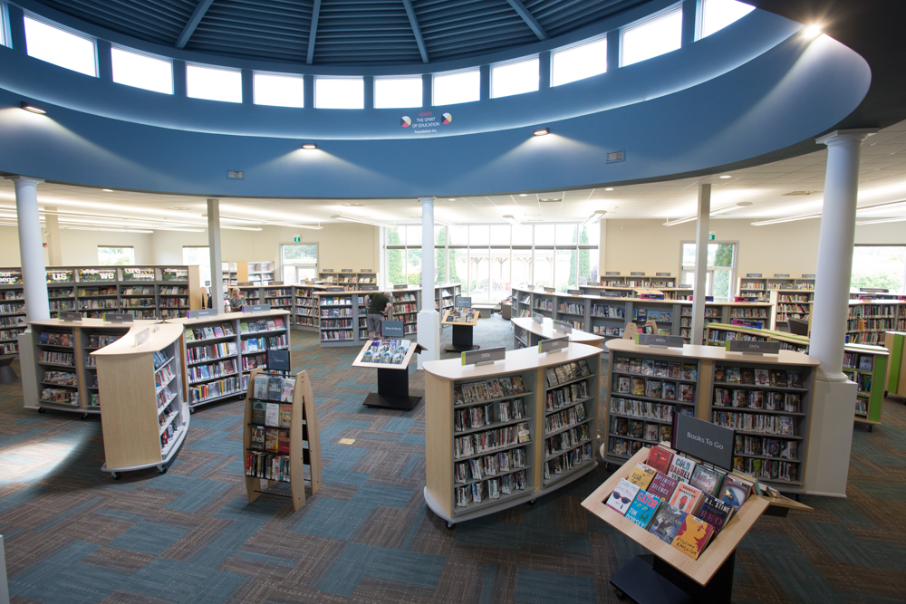
Niagara-on-the-Lake Public Library
Learn how the interior design at Niagara-on-the-Lake Public Library seeks to balance the needs of different communities harmoniously in one library.
View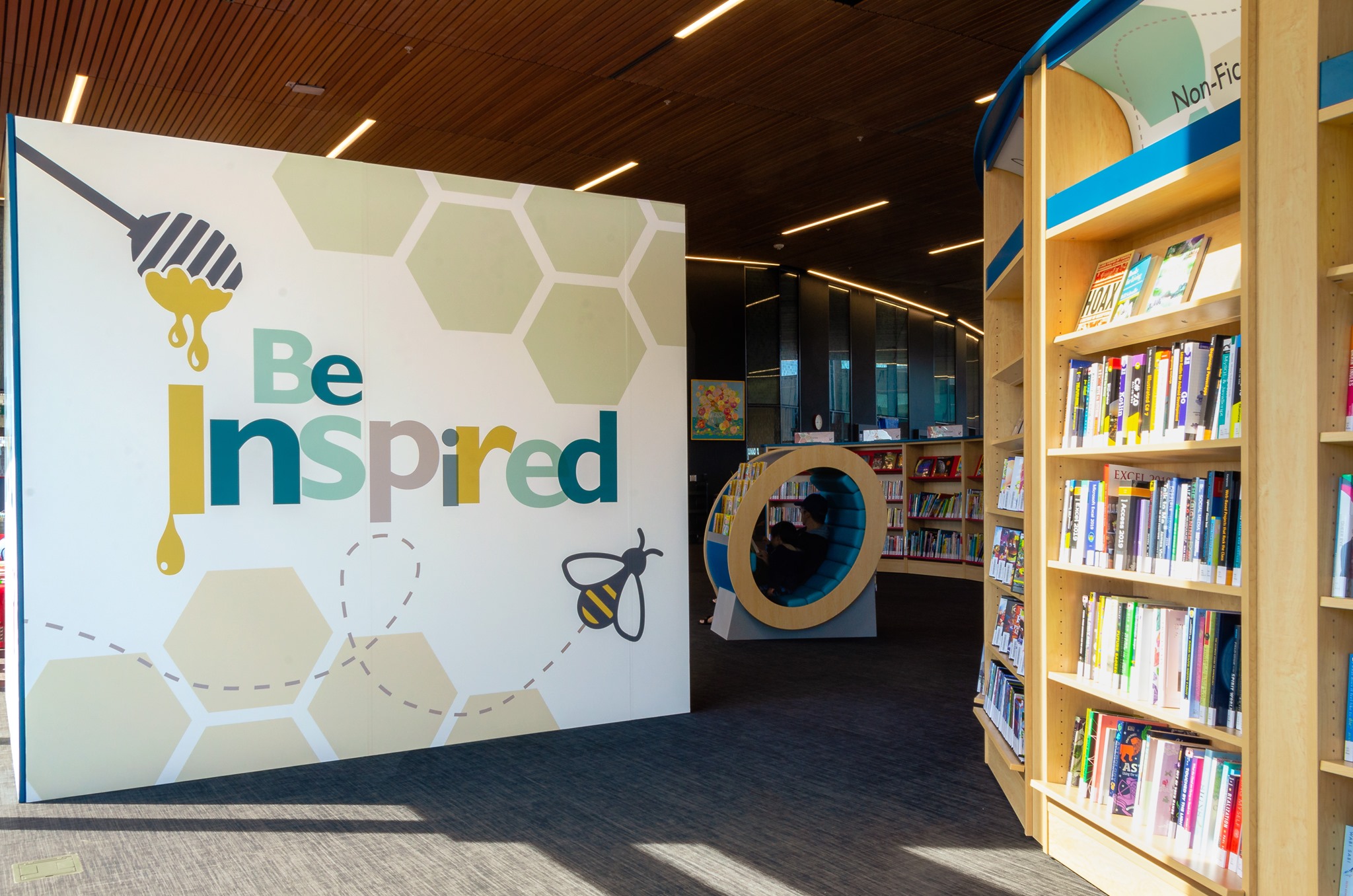
Revolutionary Library Design
New library buildings often end up with traditional library interiors. The story of Milton Public Library's Sherwood Branch shows how the shelving layout at the core of every library can be re-imagined to match the building aspirations. Get this right and both footfall and circulation will out-perform all expectations!
View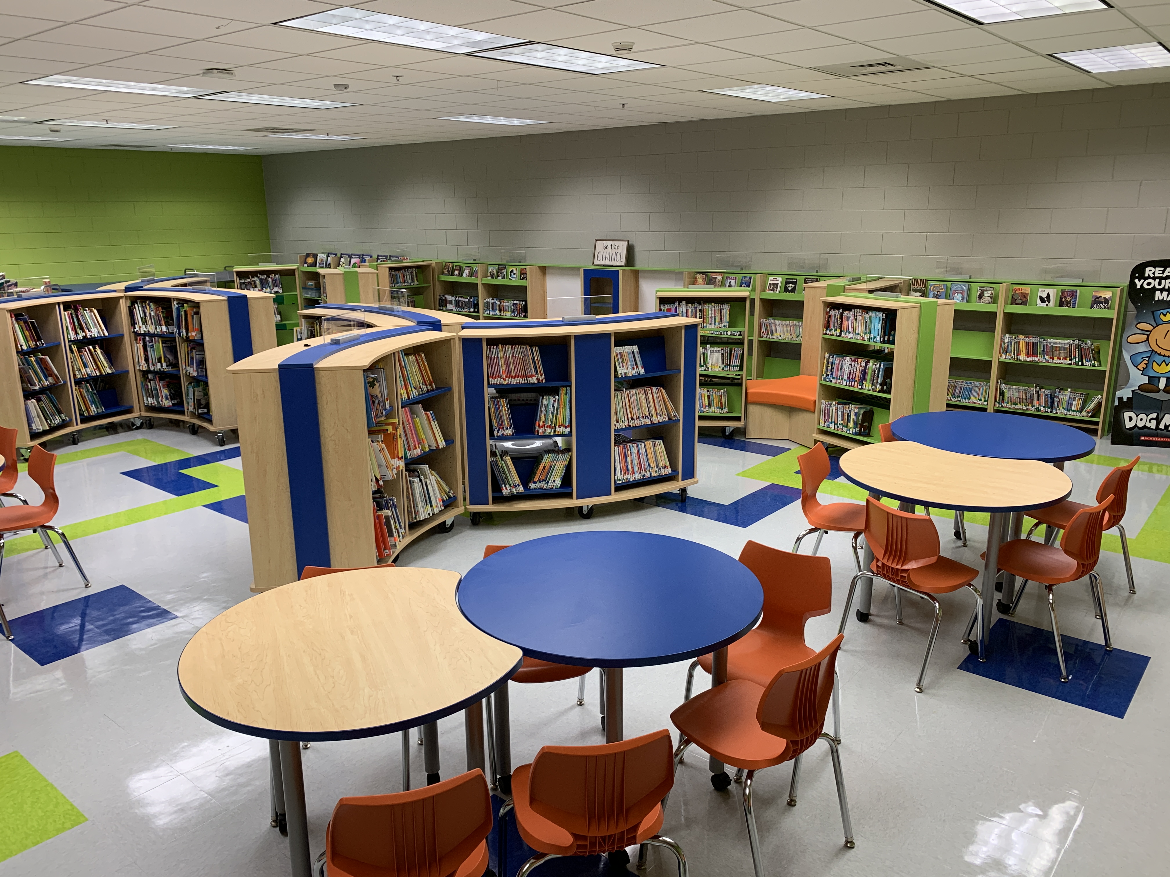
Elementary School Library Makeover
Read on to learn how Opening the Book designed a school library to be the flexible, functional space that they needed.
View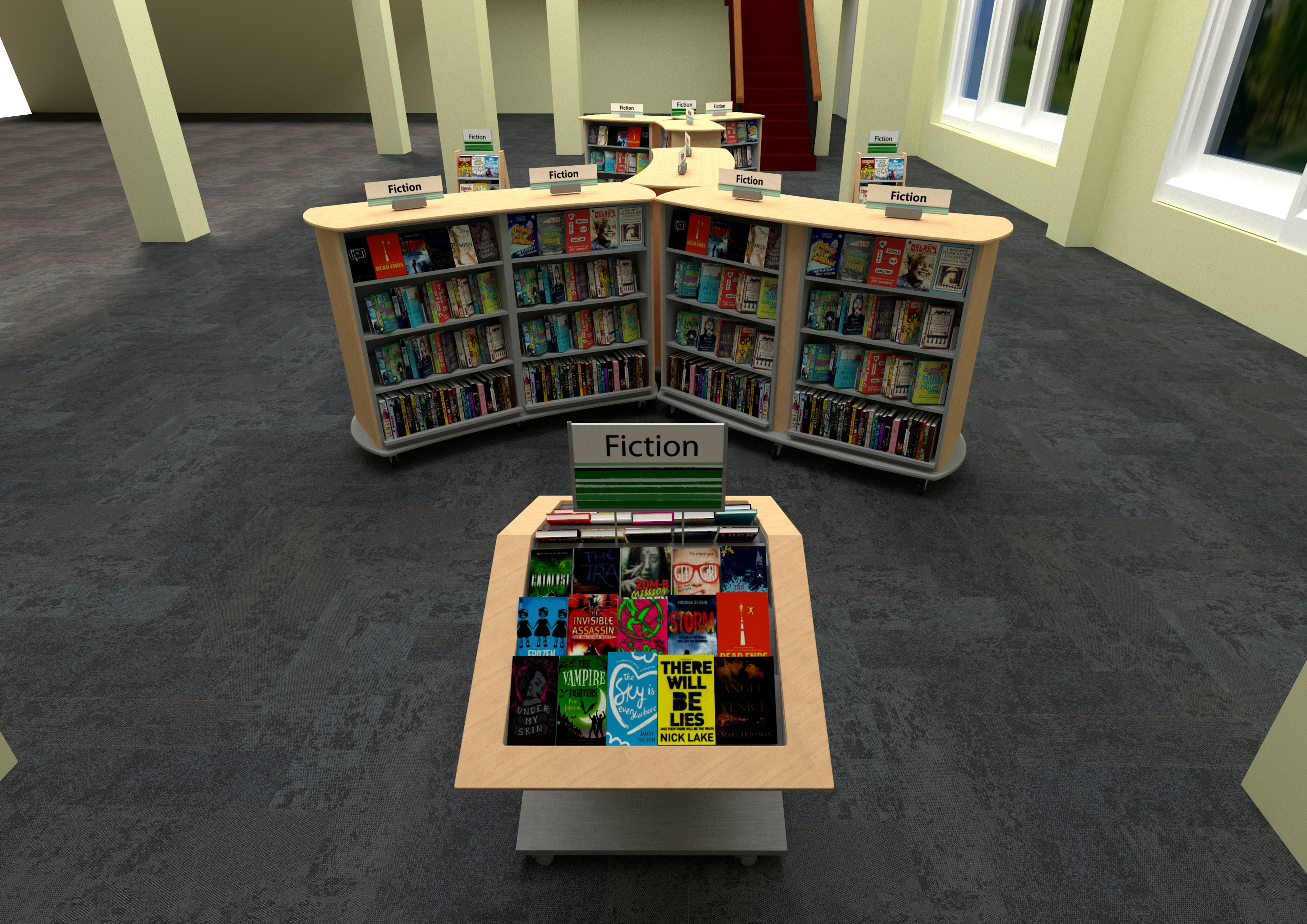
Library Entryway Design
Learn how Opening the Book designed a library entryway to create an impactful first impression and showcase their new materials collection.
View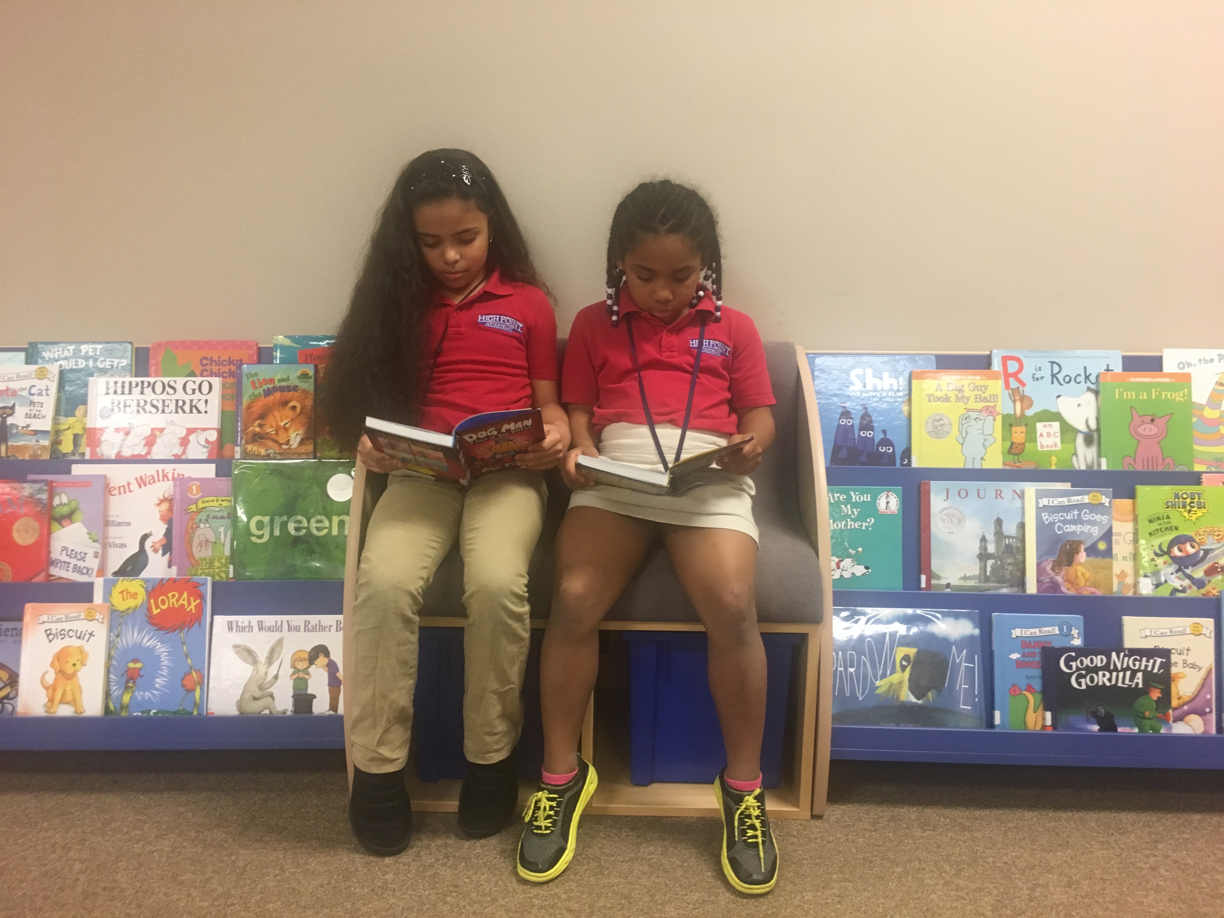
School Library Furniture Update Helps Students Find New Reading Choices
See how Opening the Book helped High Point Academy open up new reading choices to their students with a layout and school library furniture change.
View
The Heart of a Texas School Campus
Balancing functionality and budget with jaw-dropping features – and all turned round in a week!
View
Creating Browsing Neighborhoods
How Opening the Book supported one library’s move to replace Dewey with friendly neighborhoods of related subjects.
View United States
 Canada
 United Kingdom


